


EN
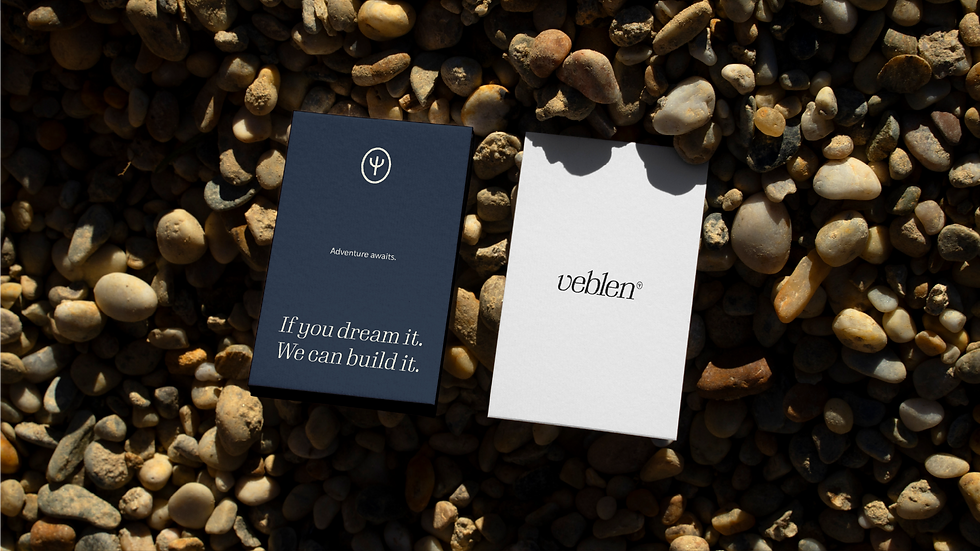
We created a logo for an Australian boat brand called Veblen. We aimed for a cleaner design, accompanied by a symbol that will be present throughout the brand’s communication. The idea was to develop something sophisticated yet distinct from competitors, incorporating the concept of a trident into the symbol and typography, as well as the ripples in the water created by the boat as it sails, in one of the logo versions.
The typography was modified so that the edges resemble the shape of a trident’s tip. The letters were tilted (italicized) to convey a sense of movement and evoke the waves created by the boat. The combination of rounded and straight elements in the letters balances sophistication with a handcrafted feel.
PT
Criamos um logo para uma marca australiana de barcos chamada Veblen, pensamos em criar algo mais "clean", acompanhado de um símbolo que estará presente em toda comunicação da marca. A ideia foi desenvolver algo sofisticado, porém distinto dos concorrentes, incorporando o conceito de um tridente no símbolo e na tipografia, além das ondulações na água criadas pelo barco ao navegar, em uma das versões do logo.
A tipografia foi modificada para que as bordas lembrassem o formato da ponta de um tridente. As letras foram inclinadas (itálico) para transmitir uma sensação de movimento e evocar as ondas criadas pelo barco. A combinação de elementos arredondados e retos nas letras equilibra sofisticação com um toque artesanal.